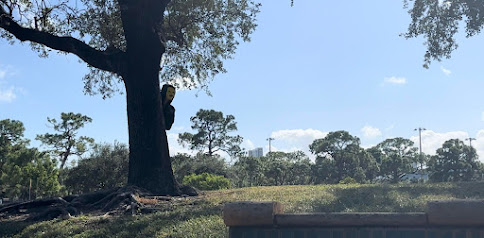
Hey blog! I'm back! Filming day two was very successful! Surprisingly enough my group got the filming done a lot quicker than I thought we would. Yesterday was the second day of filming. Around 11 scenes were filmed yesterday. After the first day of filming the music video was only 26 seconds long. My group knew we needed to make the scenes at location two longer. I'm not sure if I already told you, but Holiday Park was where we filmed the second part of the video. Yesterday was probably my favorite filming day. That may be because got hit by a car (for the video) and when I watched the footage over I couldn't stop laughing! In the first part of the video it was mainly focused on Kylie and what she was doing as I was "stalking" her. With our latest part of filming I was involved in a lot more scenes. I was shown walking after Kylie and allowing myself to be seen by her. Now that the filming part is over, its time to start editing. Rowyn has stated putting the vid...
Hey blog! I'm back with an update! After a lot of planning, we started filming today! When we first started filming it was a bit of a mess. There were a few issues that did set us back a little bit. The group had some trouble taking the filming seriously. Many takes were needed. I wasn't needed in these film because my part is later on! So instead, I worked behind the scenes. Although working behind the camera isn't as fun as being in front of it I had a lot of fun! Based on what has been filmed so far I think this the outcome of this film is going to be really good! As we start to get more into making the film I am going to step up and pitch in a lot more. Making this process as easy as possible is my number one goal. Hopefully filming will get a lot easier and we can complete a lot more in a shorter time. One of the biggest problems out group has is being able to meet at the same time. Due to all of us being busy, finding time to film is difficult. In the time that we do...
.jpg)
Comments
Post a Comment