Planning - Title Design
Hey blog! Today we are starting the planning process of our Final Task!
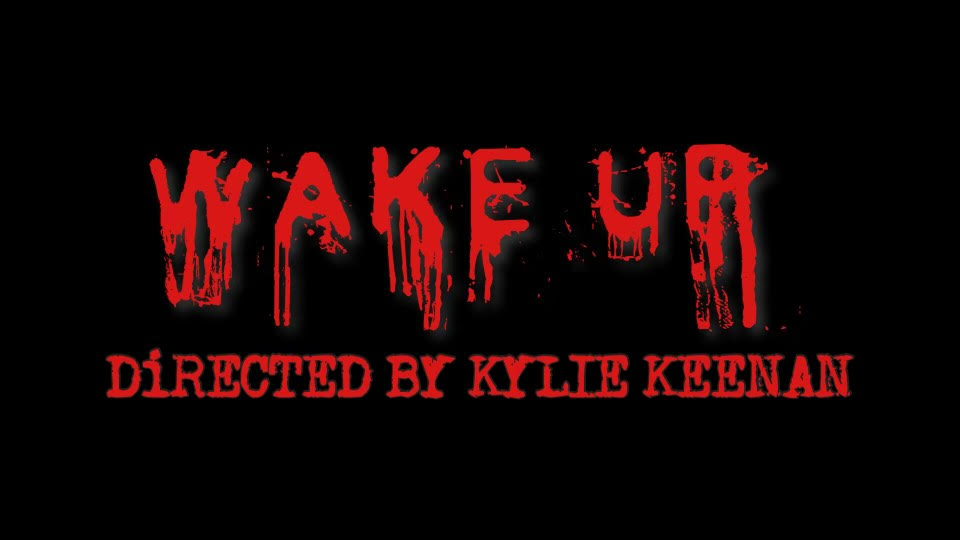
The font we chose to use are Old Typewriter and Cold Night for Alligators from the website Dafont.com. We wanted to go for a creepy vibe so we chose these two fonts because they succumbed our expectations. Old Typewriter had a very eerie look to it which went with the theme we are trying to achieve. We loved the old look to it because modern type writing fonts look too clean so we wanted more of a messy look. Our second font was Cold Night for Alligators, despite the interesting name, it had a perfect look to it.
The background of the title design is black and the words are a bright red. We used a font that looks like dripping blood, hence the red color. The font size is 170 and is in all caps so it appeared to be really big on the screen. We wanted to enhance the feeling of horror and let the audience know right away that this is a horror film.
The title of out film is Wake Up. We have had this name idea for a while because it matches with what our film will be about. I doubt it will be changed but we never know what will happen. Each title will stay on the screen for about 3 seconds, long enough for the audience to read it. They will show up as a fade in and will fade out. This is to give off a suspenseful feeling and to make the titles flow. The main titles like the film title and the name of the director will be at the end of the opening sequence because they are the most important. Both of the main titles will be one the screen at the same time. "WAKE UP" will be above "DIRECTED BY KYLIE KEENAN" in much larger font.


.jpg)
Comments
Post a Comment